This is a space for ongoing visual experimentation — a collection of motion studies, posters, and short-form explorations where ideas are tested, stretched, and reimagined.
These works represent the sparks between tools, concepts, and curiosity: quick trials, playful detours, and unexpected moments that evolve into new directions for future projects. They inform my practice, challenge routines, and open up room for approaches that don’t always fit into client briefs.
As a personal project, I reimagined the visual identity of the US Open to give the tournament a fresh and contemporary appearance while retaining its iconic character. The redesign draws inspiration from the energy and contrasts of New York — polished yet raw, structured yet spontaneous.
Recognizable brand elements were treated with respect and subtly evolved rather than replaced. The result is a visual system that feels modern, urban, and dynamic. The project includes a motion design trailer and a cohesive series of AI-generated visuals, creating a unified aesthetic across moving and still imagery.
For the redesign of Elastique.’s website, I was responsible for the art direction. The goal was to refine and modernize the agency’s digital presence while maintaining its distinctive character.
Core visual elements such as typography, color, and illustration style were reworked and aligned to create a more coherent and contemporary appearance. The new design balances clarity and expression, reflecting the studio’s interdisciplinary approach and attention to detail.
At Mobile World Congress 2023, I was responsible for the art direction of Deutsche Telekom’s exhibit API-Racer, where corporate design, interface design, game design, and animation came together in a dynamic, skill-based game. API-Racer gamified the concept of API technology, transforming a complex technical topic into an engaging interactive experience. Visitors navigated through an agility challenge that showcased the possibilities of API-driven connectivity — a playful demonstration of Telekom’s innovative approach to communicating technological progress.
At Mobile World Congress 2023, I was responsible for the art direction of Deutsche Telekom’s exhibit API-Racer, where corporate design, interface design, game design, and animation came together in a dynamic, skill-based game. API-Racer gamified the concept of API technology, transforming a complex technical topic into an engaging interactive experience. Visitors navigated through an agility challenge that showcased the possibilities of API-driven connectivity — a playful demonstration of Telekom’s innovative approach to communicating technological progress.
I developed the corporate design for wtf, a bold and unconventional film production company. The logo reflects the brand’s playful, relaxed attitude while maintaining flexibility in its use. It captures wtf’s essence of challenging norms and asking daring questions, aligning with their mission to produce content that conveys unfiltered truth and strong creative identity. The design embodies the company’s interdisciplinary spirit and openness to new perspectives for global brands.
I developed the corporate design for wtf, a bold and unconventional film production company. The logo reflects the brand’s playful, relaxed attitude while maintaining flexibility in its use. It captures wtf’s essence of challenging norms and asking daring questions, aligning with their mission to produce content that conveys unfiltered truth and strong creative identity. The design embodies the company’s interdisciplinary spirit and openness to new perspectives for global brands.
As Creative Lead for an international project at Auto China 2024 in Beijing, I oversaw the creative direction and media production for the BMW Group. The event showcased BMW’s innovations in electrification, digitalization, and circularity, including world premieres of new BMW and MINI models. The BMW Vision Neue Klasse, a preview of BMW’s next generation of vehicles, was presented to the Chinese audience for the first time. My role was to guide a multidisciplinary team in creating a cohesive and impactful visual narrative for this global stage.
Agency: Elastique.
Client: BMW Group
Photos: BMW Group
Retro gaming has been celebrating a renaissance in the past years and proves its lasting popularity. Together with a team of gaming enthusiasts, the Weinberg-Krug café in Kassel organized the first Retro Gaming Festival. The poster and information material designed for the festival express the duality in color, typographically quote the genre and through their composition build a bridge from the past to the present.
Retro gaming has been celebrating a renaissance in the past years and proves its lasting popularity. Together with a team of gaming enthusiasts, the Weinberg-Krug café in Kassel organized the first Retro Gaming Festival. The poster and information material designed for the festival express the duality in color, typographically quote the genre and through their composition build a bridge from the past to the present.
The book Fractals, created for my bachelor thesis, explores how complex scientific ideas can be made tangible through sensory perception. Unlike other mathematical disciplines, fractal geometry studies forms found in nature rather than those conceived by the human mind. The book’s design mirrors this theme, complemented by an augmented reality app that expands the reading experience through animated and interactive content.
The book Fractals, created for my bachelor thesis, explores how complex scientific ideas can be made tangible through sensory perception. Unlike other mathematical disciplines, fractal geometry studies forms found in nature rather than those conceived by the human mind. The book’s design mirrors this theme, complemented by an augmented reality app that expands the reading experience through animated and interactive content.
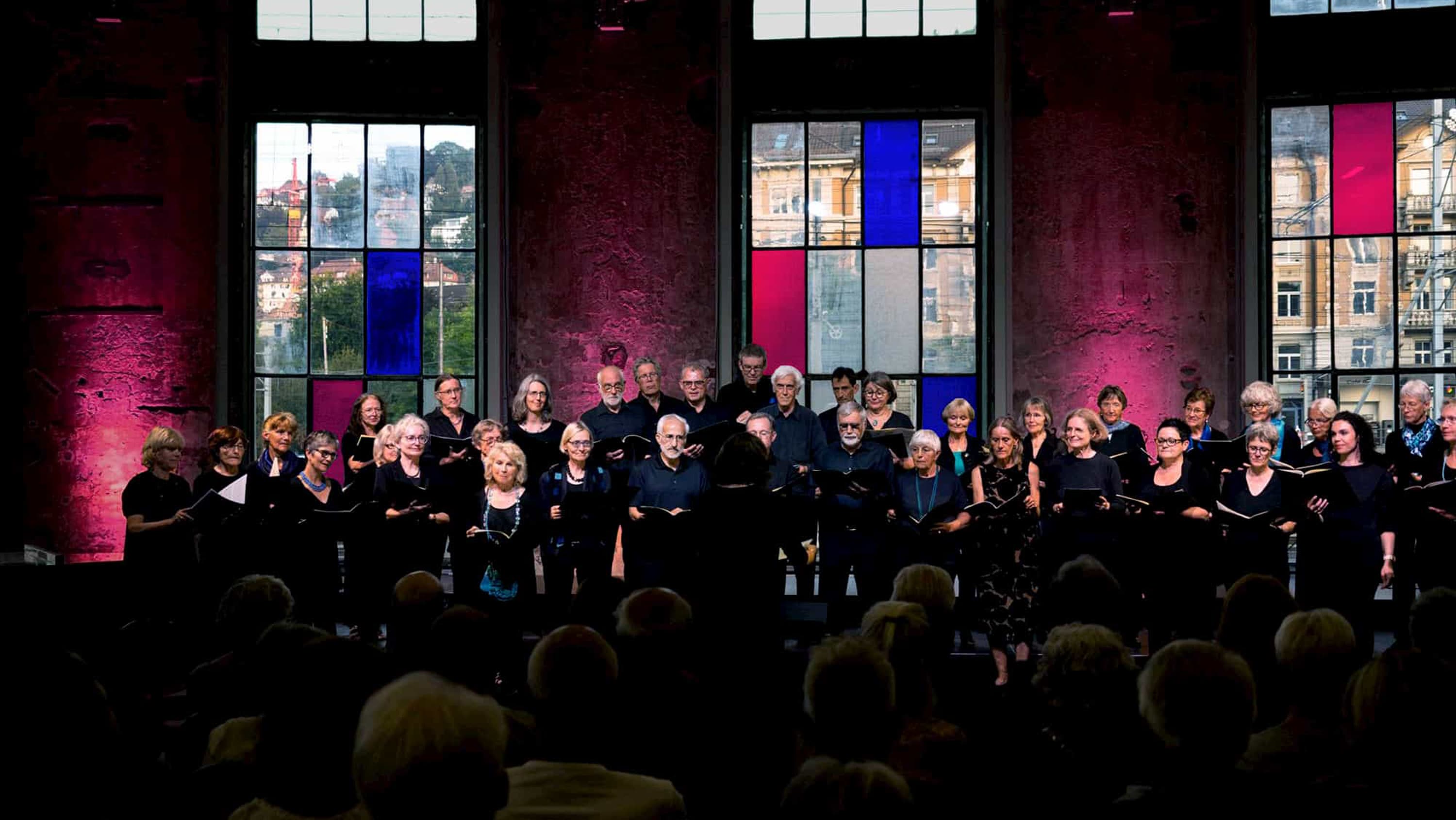
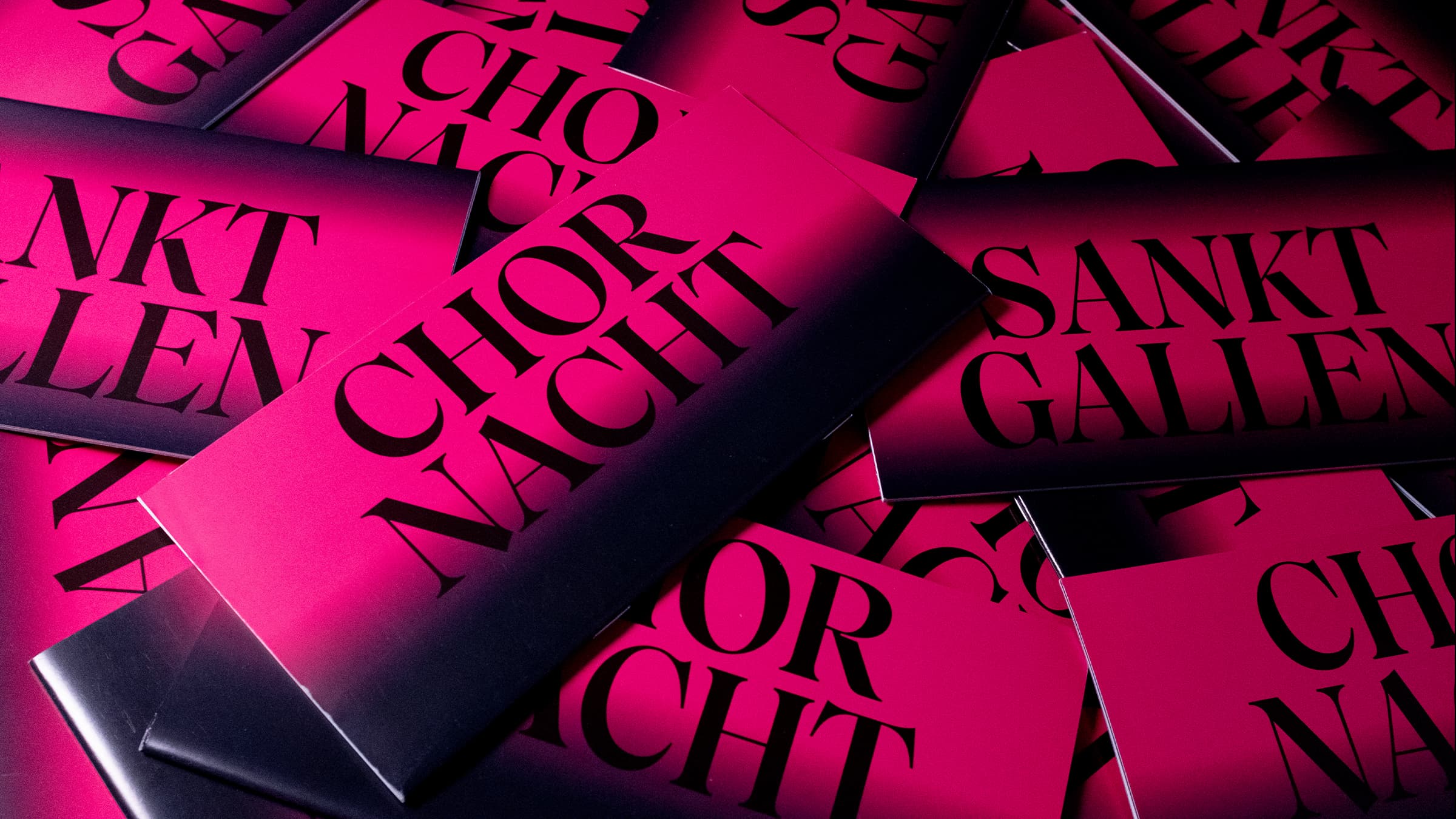
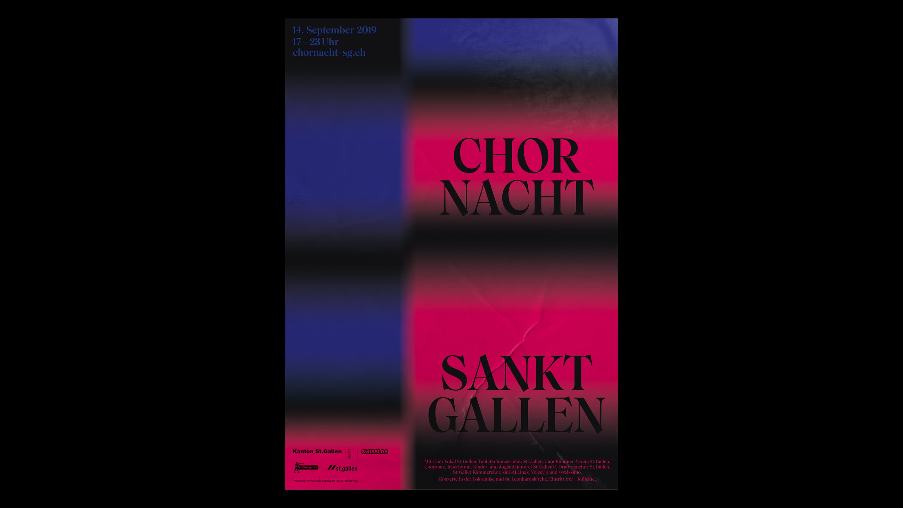
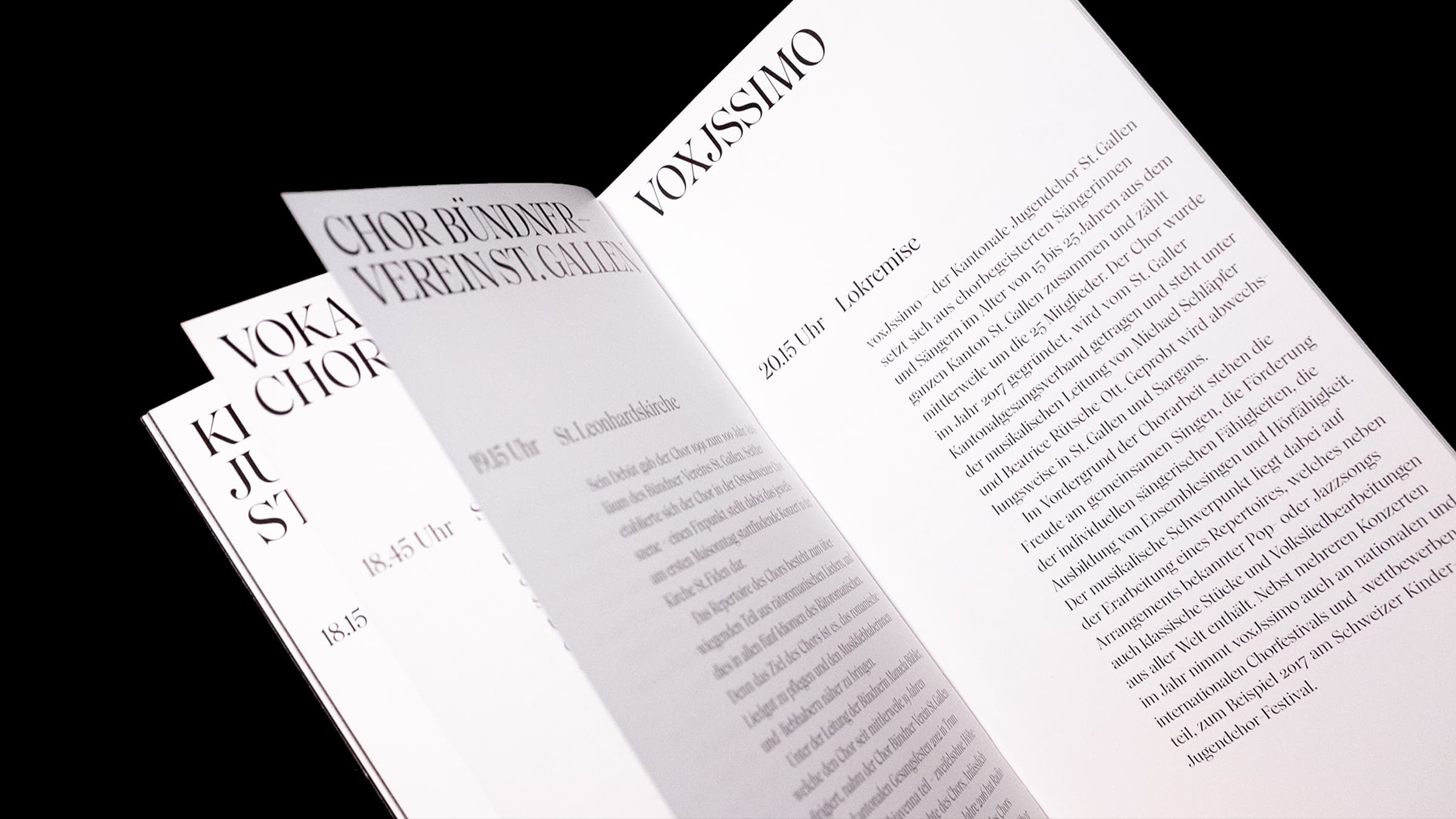
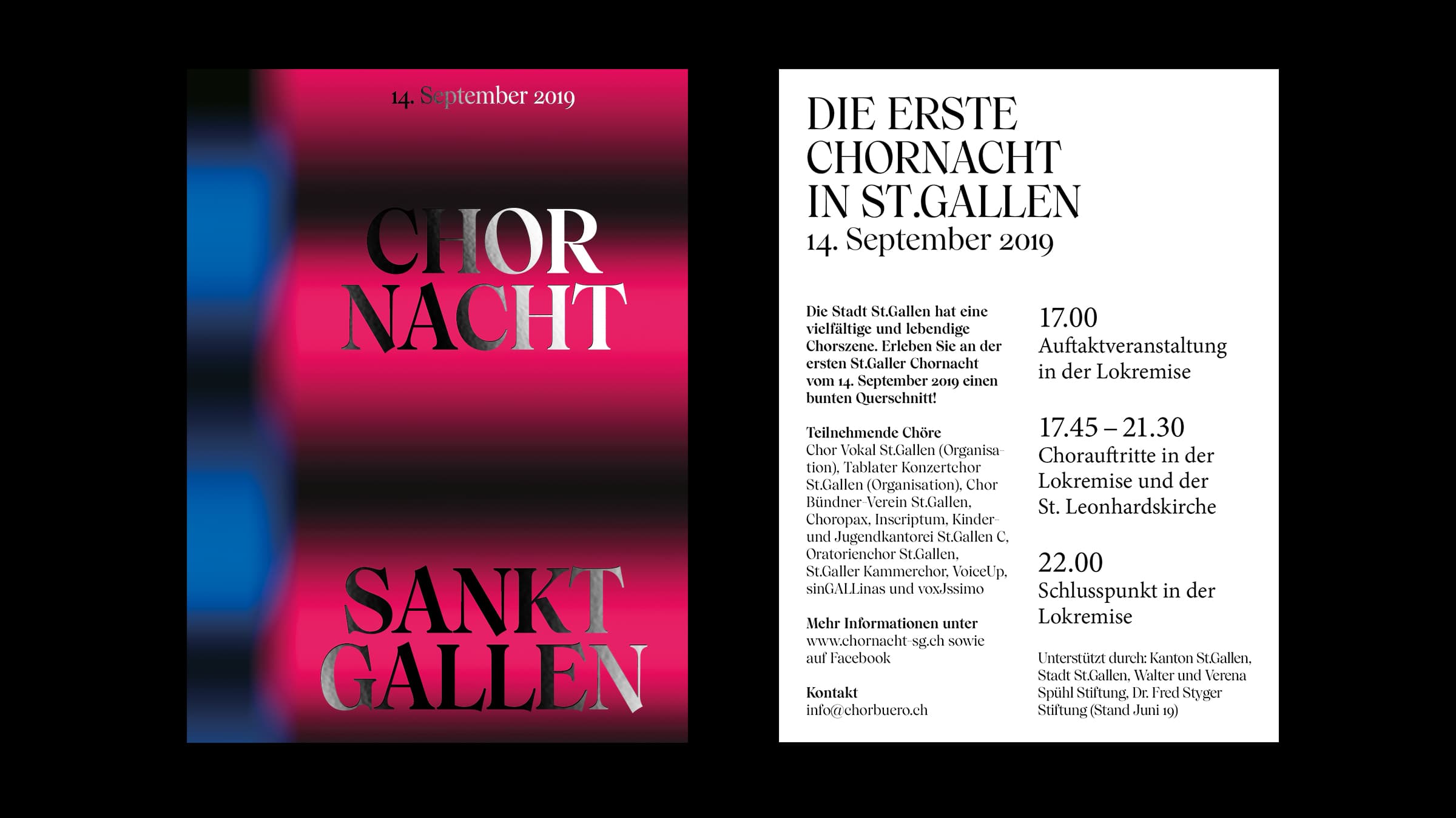
Rooted in a long tradition, modern choirs today have evolved into diverse ensembles full of creative expression. This development inspired the visual identity for the first St. Gallen Choir Night in 2019, created in collaboration with designer Olivier Bucher. The design plays with the idea of “bringing light into darkness,” combining vibrant contrasts and distinctive typography to shape the festival’s dynamic and resonant character.
Rooted in a long tradition, modern choirs today have evolved into diverse ensembles full of creative expression. This development inspired the visual identity for the first St. Gallen Choir Night in 2019, created in collaboration with designer Olivier Bucher. The design plays with the idea of “bringing light into darkness,” combining vibrant contrasts and distinctive typography to shape the festival’s dynamic and resonant character.
In autumn 2019, the Georg Kolbe Museum in Berlin hosted a duo exhibition by Japanese artist Asana Fujikawa and English painter David Hockney. Fujikawa’s major ceramic works met Hockney’s 1969 painting series Six Fairy Tales from the Brothers Grimm in the museum’s grand sculpture studio. For this exhibition, I designed the visual identity, communication media, wall graphics, and accompanying catalog.
In autumn 2019, the Georg Kolbe Museum in Berlin hosted a duo exhibition by Japanese artist Asana Fujikawa and English painter David Hockney. Fujikawa’s major ceramic works met Hockney’s 1969 painting series Six Fairy Tales from the Brothers Grimm in the museum’s grand sculpture studio. For this exhibition, I designed the visual identity, communication media, wall graphics, and accompanying catalog.
My daily engagement with typography led me to design my own typeface, Olena-Regular, as an exploration into the craft of type design. Olena-Regular is a display typeface based on a broad-nib script, characterized by organic, non-parallel forms and sweeping strokes that merge into a continuous rhythm. This process deepened my understanding of typographic construction and the expressive potential of letterforms.
My daily engagement with typography led me to design my own typeface, Olena-Regular, as an exploration into the craft of type design. Olena-Regular is a display typeface based on a broad-nib script, characterized by organic, non-parallel forms and sweeping strokes that merge into a continuous rhythm. This process deepened my understanding of typographic construction and the expressive potential of letterforms.
In 2020, the Berlin-based bookbindery Klünder Buchbinderei celebrated its fiftieth anniversary — an occasion that called for a renewed visual identity. The new corporate design is built around a graphic bracket symbol, evoking associations with materials, books, and print forms crafted by the bindery. Its flexible proportions allow the logo to adapt dynamically across media while maintaining a strong connection to the company’s artisanal heritage.
In 2020, the Berlin-based bookbindery Klünder Buchbinderei celebrated its fiftieth anniversary — an occasion that called for a renewed visual identity. The new corporate design is built around a graphic bracket symbol, evoking associations with materials, books, and print forms crafted by the bindery. Its flexible proportions allow the logo to adapt dynamically across media while maintaining a strong connection to the company’s artisanal heritage.
Synchronicity marked the return of the Copenhagen-based experimental trio WhoMadeWho to the legendary Kompakt Records. The project includes three singles and one LP featuring collaborations with Frank Wiedemann (Âme / Howling), Mano Le Tough, Perel, and Axel Boman. The album artwork explores the eternal questions »Who made who?«, »Where do we come from?«, and »Where are we heading?« — translating these themes into a visually layered and introspective design.
Agency: Ta-Trung